Tuesday, 25 October 2016

RESEARCH Sigmar Polke

Sigmar Polke was a german painter and one of the artists mentioned in our group crit. His works are very psychadelic and colourful and this would be the reason he was brought up when looking at my large painting of the Venetian-esque buildings.

Looking further into his work though, I also discovered a few paintings which show almost photographically detailed drawings, yet overlayed with loose colour and pattern. I have not really touched on the use of colour within my work, as it has not seemed terribly relevant when drawing buildings. I do seem to have a habit of putting everything (including most aspects covered by colour use) into the strokes and marks I make, besides, 'everything looks better in black and white'. (While I personally have a soft spot for colour, the idiom exists for a reason, it being more straightforward and definitely simplified). I will, however, make colour associations when making my etchings on the sheets of acrylic I have, although simplified perhaps. While Polkes use of colour in these images (above) is very subtle, even subtle colour does have meaning.

(unable to find image names)


400 WORDS Adam Adamowicz

Adamowicz was one of the concept artists who worked on Bethesda's The Elder Scrolls: Skyrim, he worked on the architecture in the game, which embody the cultural and visual aspects of the in game world. He adhered to the text (The Elder Scrolls series), which has thousand of years worth of fictional history and in depth regional culture when creating his buildings. I think all of my works both contain and, to some extent, are this possibility; of history; of a dreamworld with its own reality and laws. While he had this very specific group of sources for his pieces, they also came from somewhere in the real world, Skyrim having a very strong Viking motif. This cultural influence is something which I have not looked into specifically but have used as more of a secondary source throughout my project.

What I find interesting in his works also, is that he does not have this luxury of a figurative style, and relies heavily on the culture and also the landscape, much like Alan Lee in his work on Tolkien's books. Skyrim contains many mountainous regions and he uses these to create his architecture, or even vice versa? Perhaps they are one in the same, much like the architecture in the real world is shaped by the landscape and the people who live there.

This is what I find so interesting about the whole idea, that Adamowicz has used a plethora of existing history to create fantasy. While I supposed that is what I have done by looking at their artists, what is so appealing about fantasy is that it can come mainly from within. When I put down my worlds on paper, I create the history, the people who live there and the culture. While this is sourced from real cultures and people, it is also an extension of myself.

This would probably be the most modern take on fantasy drawings and architecture I have looked at, and seeing these sketches and paintings rendered in full 3D is something I find really exciting. It is also that element of playing god and having complete creative control, even if the concept is not overly specific. I would like to create something like this world with my 3D blocks, still harking back to Escher's pieces and my original research, but creating a small version of a world, like the one featured in Skyrim.

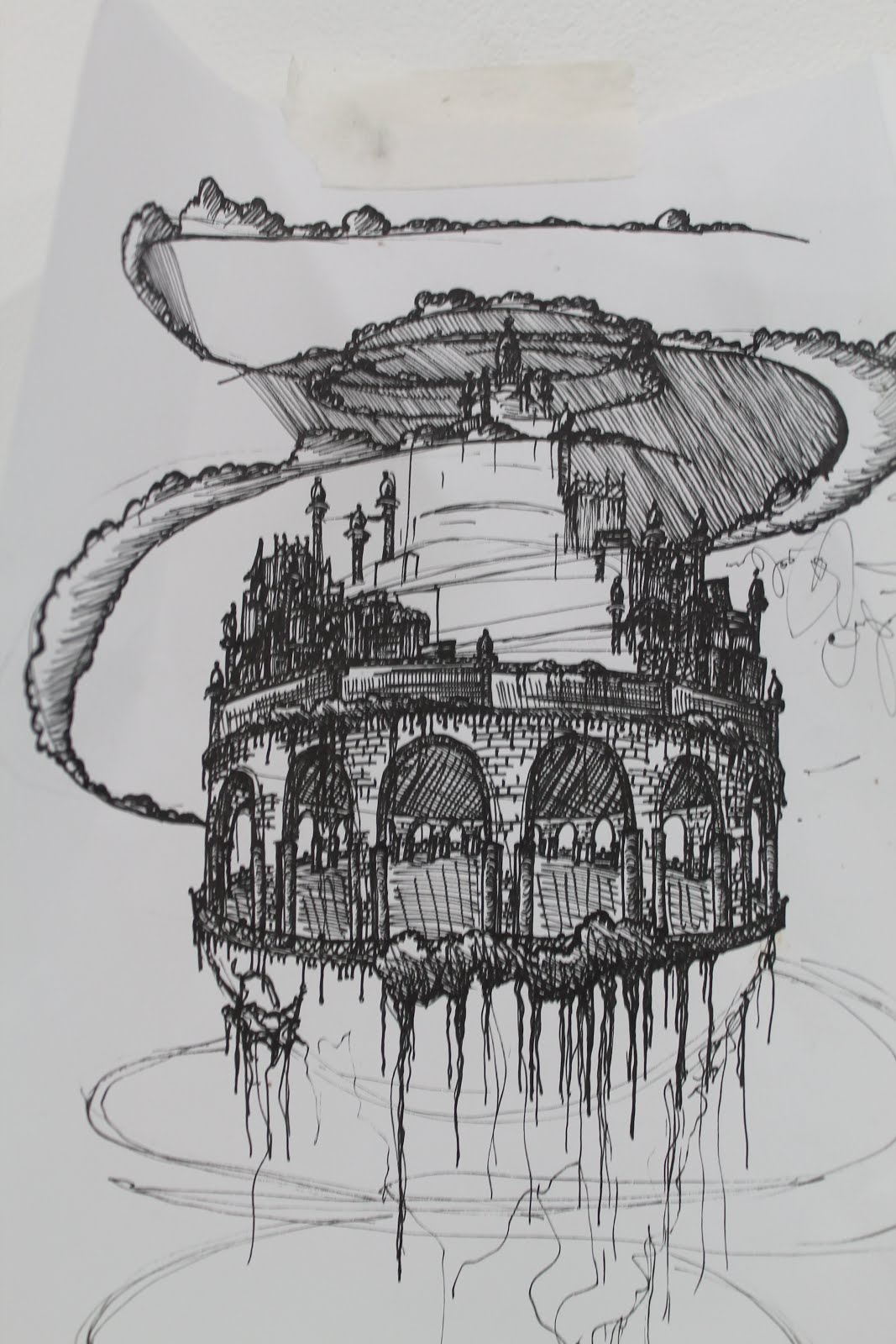
(unable to find title, below, top) (Markarth Exterior View, below, bottom)


3D photographs

Escher relation- These are photos of the blocks I have made to experiment in 3D.

varnish/ etching idea- while I do not have the time to create a much larger piece, I am extremely happy with the way these blocks turned out. They have given me a way to combine my ideas of etching and printing with 3D work. I would like to stain the pieces and etch scenes or city scapes into them, creating a world in the blocks as most of my relevant artists have done in their work. The varnish would be a dark one, following on from the cubism ideas and the simplistic unfocused view I have on colour during this project as a whole.

This overlay of my previous drawing best demonstrates this idea.


Tuesday, 18 October 2016

RESEARCH Allan Lee/ Tolkien

JRR Tolkien wrote the Lord of the Rings series, but he also created his own visual representaions of the worlds he wrote about. I have looked at a book of his own sketches, and was astounded by the style and detail. All the pieces in the collection appeared as though out of a 30's printing press for a classic novel. (The Trolls, below)


While researching Tolkien's works, I initially found a copy of a version Lord of the Rings illustrated by Alan Lee. While the pieces are detailed and wondrous to look at, they are quite photographic, as they are based on scenes from the films (The Black Gate, below). The concept is there, yet the imagery lacks a certain creativity, Tolkien's and my own seem to get this world across in a more abstract way, giving a feel to the worlds through the techniques and styles, rather then relying solely on imagery.


400 WORDS Escher

Escher was the sparking influence for this unit. I initially looked at his work for the surreal architecture, feeling that it was akin to my ideas about fantasy architecture and also I really enjoy the way his pieces play with the viewers perception. I found the technical, mathematical representation of architecture very satisfying to look at and also how the element of the almost playful was introduced with the impossibility of the layouts.

This is something I am very keen on replicating; not so much the playfulness, but the personality, despite the technical, repetitive way I draw. I hope to do this with my blocks, which in themselves are very simple, repetitive and geometric. What I can add to these blocks though, is entirely up to me, so they are a very good base to work on in this respect.

Whilst I was initially interested in his work with buildings and impossible architecture, this quickly grew into the possibility of using tessellations within my work. Escher created huge murals of evolving, flowing images (Metamorphosis II- 1939-1940, above), which involve both archiecture and tessellations. These elements physically blend into each other, which got me to thinking how I could blend them in my own way, but also by 'free association', which I hadn't previously considered before reading Micky Piller's thoughts (The Amazing World of M.C. Escher). The entire metamorphosis is a tessellation (a term which is not as strict as it sounds). Perhaps photography is a good way to plan this, yet it links back to this idea of adding my style to the blocks, which could simple be achieved by etching on to either a few or all of them.


Escher first looked at tessellations when attedning the School of Architecture and Decorative Arts in Haarlem, where these technical skills were a major focus. His father, having worked in Japan, and the objects he acquired during this time would also have influenced his work in this area, according to Micky Piller. So even though my main influence from Escher was not his work on impossible architecture, his work with tessellations still comes back round to it. What looking at Escher really did for me was help me to see all the woven links between archhitecture and art, helping me bridge a few of the gaps I was worried about, initially, in my practice.

400 WORDS Sergey Tyukanov


Sergey Tyukanov is an illustrator who works in different mediums, including etching, to create strange and wonderful architecture. While not simply fantasy, in so far as being used in an actual story (and having an extra touch of surrealism in there as well), he designs city scapes or simply floating groups of buildings in different shapes. These shapes include, and mainly consist of cutlery, china and other objects you would generally find your kitchen. Animals are also featured, with cities growing out of their backs, though landscapes and natural form do not feature very heavily, which sets him apart from this general rule I have picked up on from other artists.

What initially interested me in his work, was the sheer amount of detail he pours into them, far surpassing the limited intricacies of actual architecture. His piece Castle of Time- 2007 (right) is based on Neuschwanstein Castle (left) in Bavaria. Tyukanov says his castle is 'so light and air-like that it lifted off the ground', which obviously came from the experience of seeing this elegant structure with its spires high up in the mountains. This element of realism is ever present in any buildings I draw myself, using foreign architecture as a starting point, simply because it is exotic, and therefore fantastical.


 What I find most intriguing about Tyukanov is that each piece on his website is attatched to a short paragraph which tells the story. For instance, with Flying Dutchman- 2007 (left), 'a wandering ship that had been travelling forever and will never reach its destination'; or Coffee Pot- 2007 (left, below), 'in this world of metamorphosis one can see ordinary things turn into houses'. This reversal of the typical illustration trope of an image to accompany a text is another take on the way my drawings tend to exist on their own.
Tyukanov has told the story of his pieces, not so specifically as to distract from the image, but to enhance it, much like novelists use illustration in their books. I could apply this to my piece (below). For instance 'The attack had left the city shaken, but the river was flowing again', or something equally vague. Yet when I apply this to my own pieces, I feel it is so unnecessary, it does nothing but make me cringe. I think this is because each image I create is an entire scene, layed out before the viewer, there is so much going on and also nothing at all, while Tyukanov's seem to fuel the need for a story, having but one subject. 


LECTURE 18/10/16

Ben Owen

perfomance/ music/ gigs

cubic residency-
work from care home- vulnerable people wit dementia

'the pink room'
from prologue to twin peaks (film) David Lynch

band a part- goddard, narrator speak for the characters thoughts, music foreground/background emphasis

black cat white cat- costa rica, music is its own character- breaks the fourth wall, it interrupts and inteervenes.

caro diario- non (cant see source) and digetic (source is known) sounds, fictional documentary about film making, pasolini.

walter murch- writings on editing, pyhtagoras talking about resonating planets, check up theory

stan douglas- double sided screeen, performance and outtakes, representing the community of jazz in aris, that directors like goddard were a part of.

cameron jamie 'massage the history' humping furniture- the strand

While the talk with Ben Owen was extremely interesting, as is was all about sound and video work, I believe there is not much to relate to my practice however. The pythagoras theory he mentioned was what interested my the most. It is the theory that he planet resonate with each other and we humans pick up on this, for creating music, art or anything really. also relating to 'waking up on the wrong side of the bed'. This is as best as I can understand the theory from touching on it today.


Monday, 17 October 2016

Crit outcomes

Jerwood drawing prize image (look at artist perhaps, research)

games, Minecraft, literary influence relating to games and Duchamp/ Minecraft. Alegaro Boetti

Artist to look at- Sigmar Polke.

After coming out of the group crit I feel so much better about my direction and the work I am creating. While I was worried I was going into a too illustrative pathway, my peers and tutor all like the origins of my ideas; the literary influence. I need to look further into artists/ illustrators who worked in the style for novels and fantasy. I think I have become too bogged down with Escher and his geometry, while it sparked my interest, i must allow myself to move on. I also became a bit too obsessed with finding meaning in my work straight away, worried I was getting too close to architecture, I kept trying to find meaning in it, to make it architecture as art as opposed to just architecture. I realise I am only interested in architecture on a shallow level, in a very stylistic way. It is the fantastical aspect of the project and the detailed way I work which compliment each other and interest me.


On the subject of gaming and fantasy, the 3D blocks I wish to create put my group in mind of  Minecraft, where anyone can create their own scenery and architecture. This is also what i want to get from my sketches, the audience applying their own story.

3D- Maquette Plans

Using this basic model of the tessellating shapes from Escher's work, I have developed the idea into creating a rearrangable cityscape. While I could take this further and create a bigger piece, I wish to somehow apply the detail of my current technique (etching onto the blocks perhaps).

Could also use the blocks, rearrangable as they are, as a source for layouts of future sketches, before setting them as I want and apply details?

Etching Ideas- Fantasy Castle

Looking at artists like Tolkien, who created visual works for his novels, and Surgey Tyukanov, who creates amazing fantasy buildings and detailed sketches, has helped me develop my interest in these fantasy scenes. This piece is one I would like to etch or print- will visit the printing facilities at Bower to see how to best etch and print the piece. While originally another plan for my large etching, this piece harks back very strongly to my literary influence; I kept the piece as close to the intricate line work used in old literature as possible. I will attempt to figure out a direction with it after my group crit- whether to print or etch or simple keep as a plan for larger etching.

RESEARCH Mike Kelley

Mike Kelley's piece 'City 0000', inspired by the city called Kandor in the Superman comic books, is an amazing 3D piece. While it is a little too sci-fi based for my taste, the same basic principle of creating this fantasy world applies. It is not terrible relevant apart from that, but I believe the piece is beautiful. His use of colour and almost simplistic style really speaks of comics books and their strong graphic style, which contrasts the amount of detail and monochromatic imagery I use in my sketches. While I will probably combine my etchings and sketches with plastics and glass at some point, I feel colour adds another element to these cityscapes, which currently I do not find terribly important.

Tuesday, 11 October 2016

RESEARCH Cubism


Looking at Escher's geometric pieces puts me in mind of the typical masters like Klimt' Klée and Picasso.

George Grosz, while not typically associated with the cubism movement, he gained a lot of influence from it. One of his paintings (Metropolis- 1917, left) really ties in with what I'm looking at; busy, full framing, strong, dark colours and the architectural subject matter. The buildings in this piece have a heavy, exaggerated perspective, a quality you do not really see in Escher's work, or my own. I do think, however, the full framing and detail are really inspiring.


Paul Klée's (Poster Houses with Stairway, left, Three Houses and a Bridge, below) architectural pieces are very similar to the large plans I have painted for my etching so far. They are strongly geometric and even remind me of the tessellating shapes of the 3D plans I have started to create, filling the page with constantly repeating shapes, while quite simple. It is actually an interesting take on this idea, while they are tessellating and fit together with a precision that I really like, I find them less harsh, less technical than Escher's pieces.

3D plans/ ideas- sketch book

Some further sketchbook works- using the key ideas of Escher's tessellating shapes, combining them with my architectural details.

j

LECTURE 5/10/16

research talk- can look at pictures not just books.

Time Smoking a Picture- William Hogarth (1761)
scythe through the image, smoking into picture, jar of varnish
typical hogarth- text/ symbols overlaying

heirarchies- some things are skated over in books, don't simply read main articles, look at foot notes, research, references.

Hogarth- 'Sigismunda' (1759), was an unpopular image, but can still be releveant to your practice, don't dissmiss things because the people of the time, writing about these things, did.

'Smoking a Picture'- aging it, adding value, though the fgure is damaging the painting the piece is an attack on old paintingsm no one is buying new works. Hogarth is demeaning the audience who subscribe to this ideal. Can they see what's infront of them or are they being told. 'time is not a great artist, he weakens what he touches'. statues begin as art, then decay into 'value'.

Varnish- put on artworks to protect art, layers and layer /(of meaning)

statues- decay into- value
paintings- decay into- meaning

Research Meaning in Architecture...

RESEARCH 'Meaning in Architecture' (A collection of essays edited by Charles Jencks and George Baird)

During a strip to the library, I discovered this book and thought it would be extremely useful with discovering meaning in the work i am doing at the moment. I had hoped it would provide some answers about architecture as an art form, but was sadly disappointed. I picked a section called 'semiology and architecture' hoping I could find some form of revelation to spark the next step in my work. What I got instead, was a few confusing, very vague ideas about how we assign meaning to architecture. What I will do then is take the quote from Charles Jencks' essay from the architect Hannes Meyer (the least confusing man in the work of literature) 'My poem is meaningless, it just is. My painting is meaningless' and I will take from it this; we assign meaning to things ourselves, that is where meaning comes from. So I shall assign my own meaning to my practice at current- and will continue to focus on the idea of fantasy.

Harrie Fuller: 'fantasy is a way of escapism because what you're seeing isn't real, therefore the meaning is unspecified and that's what you wrote says, people can look at it and give it their own meaning however they find it relevant'
When discussing this lack of productivity in this book, Ms. Fuller, a peer on the course said this in response, and it perfectly explains my feelings on the subject.

RESEARCH 'The Book of Drawings + Sketches Architecture' (Chris Van Uffelen)

In this book, Van Uffelen, an author and art historian, tells us the story of hand drawings in architecture, which have been around for thousands of years, but are used today for the generation of ideas and decision making. While they are less technical than the digital aspect of architecture, they are more about the creation of art, which links them more to my practice. The rest of this introduction talks about this interplay between the technical and the creative, and while my pieces are not exactly technical, the process with which I create them can be; each line is quite precise. 'The development of architectural style no longer relied on realised buildings as a requirement for a positive critical reception.' This quote from the section of the intro 'Rationality, Decoration and Propaganda', is extremely relevant to my practice; I do not work with realised buildings, yet I strive to make the textures and details as realistic as possible,

Literary Influence

When creating my sketches, I've been reminded of the images in the start of old fantasy books, the illustrations to introduce each chapter. This influence comes from reading books such as these when I was a child, Tolkien's Lord of the Rings series being a prime example of this. A lot of my fantasy inspiration I gained from family and the shows we used to watch/books we used to read.
Images like these would have been printed in the books in much the same way I wish to etch and print some of the drawings I have created. I will therefore look into printing processes to use with my sketches, which lend themselves well to this theme.

During this project I will also look at illustrators who work with fantasy novels or concept art for games and other media.

Large Painting Plan- Completed


While this painting was originally a plan for an etching, I believe it turned out better than I'd hoped, so I thought it was worth completing.
The brush strokes reminded me of tall Venetian buildings, so I kept the details to that style, and while this does not tie in with fantasy so much, it was good practice for detailing and is one of the more abstract pieces I have painted with architecture as a subject matter. While the 'Venetian' style does not scream fantasy, fantasy architecture has its base in these cultural elements and the little nuisences which you find in specific types of architecture.
 

M.C Escher (initial research)

M.C. Escher

As Escher is the first artist I am looking at for this project I will produce one of my artist profiles on him at a later date.

I always knew about M.C Escher as an artist who would draw surreal images, tessellating shapes and impossible architecture. His work really inspired my initial painting (left). I created this painting having an image in my head of buildings swirling into the centre of the square, much like the shape of Eschers tessellating images.


Whilst looking at his work on architecture and perspective, which I believed to be more relevant to my practice, I came across a chapter in the book, written by Micky Piller, on tessellations. This chapter contains imges of Eschers sketches used in teaching (below, right) and I began to form a more solid idea for this etching in my head(Below, left). I thought I could use these simple design but create them using buildings themselves.


Large Etching Ideas

On a trip to the scrapstore for inspiration, I found a huge square of acrylic, which would be perfect for a large etching/ cityscape. Below are some rough large scale plans I created for this.

The red square was a simple idea of a full frame, layered buildings, with various details I will add later in black, so symbolise where I would etch into the large acrylic. The multi-coloured square was a more in depth idea for the piece, but followed along the same lines as the first. It would include a variety of buildings and designs for detail, but I believe, also works as its own image (will finish as a final and work out how to mount later). The spiralled image was a more abstract idea, which I had when looking at the work of M.C. Escher.


Small Glass Painting

Using a square sample of coloured glass, I did a small scale glass painting to get back into the swing of things. I took inspiration from some of my earlier sketches of cityscapes. While I like the finished result and believe it ties in with the work I want to start creating, I don't think there is enough detail in the piece. I want to move on with the same general idea and materials but using etching and pen- to create the detail I would normally include.


Sketches- Fantasy

Over summer, my work has moved increasingly towards drawing fantasy landscapes and illustrations which tell a story. I think of them as kin to the images you would see in the first page of a chapter in a fantasy novel. I would like to continue with this subject matter and look into why exactly I like fantasy so much, while I know it comes from child hood and the interests passed onto me by my parents.
 

Thursday, 6 October 2016

LECTURE Intro Talk (Module Info)

Deadline : 5th December 2pm.

Decide whether to continue with previous work or begin something new. Consider identity as an artist, what do I like doing? I have previously worked a lot with glass and plastics and mark making, which I wish to continue. Subject matter may differ, more intricate drawings, like city scapes.  make art I like to create: fantasy, scenes, cityscapes; which tell a story. Imagine the illustrations which you find in the front of story books in chapter headings (Lord of the Rings etc..)

Produce:

Body of work, several finished works this year, less random tangents and experimentation: begin to define practice.
Document work: everything for this module will be analysed and collated on this blog- figure out specific folders and presentation at later date.
4/5 examples of artist profiles: why am I interested, why do they relate?
Assessment presentation: discuss work with assessment team, gain insight into how we are assessed.

Emphasis on final works this year; experiment with gallery presentation, use studio space to practice displaying works in a professional manner.

7th November: last day of free project spaces, (complete large works before this date)