During this unit I have learned a lot of things about my art work and the way I work. I have looked at illustrators and novelists for my main research body this term. I have started to figure out my practice, taking a lot of pressure off myself; stopped trying to fit in to my idea of a 'fine artist'.
I feel that because my research was not so limited, I have started to see how I fit in as a whole. I feel as though I have really worked out a lot of the kinks in my reasoning, by not worrying so much about why I've put a certain pencil mark in a certain place. I have been worried about my illustrative nature for a while, but now feel I am able to use that in any upcoming projects. It seems increasingly easier to talk about my work, with the introduction of terms like 'Utopia' and looking at the form of artists like Mondrian, who I would not have previously considered.
These realisations and the work I put into making them, come at the cost of my work with various processes though, I believe I got too bogged down with the 'why?' aspect and it held me back, especially at the beginning. Although there is normally a lot of confusion at the start of a project, I feel as though my momentum only appeared half way through, and I could have experimented a lot more. While I did work with 3D to an extent, I would love to go further with it next year.
I am choosing to see this unit as a base. It was needed, successful in most ways, and has helped me to figure pout a lot of things. Next year I will apply all that I have learned, will attend workshops for the techniques which I find interesting and relate to my style. I want to go further into screen printing as i find the process fascinating and am already starting to picture the work I could create. In regards to 3D work, I wish to apply my illustrations to the cold hard materials I enjoy working with; plastics, metal, glass etc... How exactly this will happen though, I am not yet sure. I will begin further research over Christmas to have a more set idea for when I get back, perhaps printing onto different materials would be a good way to start?
So, in terms of developing my practice, I believe I have been as successful as possible so far. My practical work and skills have, if not suffered, been on pause; yet my head seems more sorted than ever. I certainly feel more confident about being here and am definitely excited to use more processes next year.
Monday, 28 November 2016
Aluminium Print
I got the large drawing printed onto brushed aluminium as a last resort, due to the time restrictions I was experiencing, but I have absolutely fallen in love with the piece. I believe it looks very similar to printing plates and (though smaller than the original) it is quite large scale, which adds a contrast to the traditional feel of the material.

Glass Painting- Final

I am extremely happy with how this piece turned out, though I would have preferred to use screen printing in some way. The actually aesthetic of the painting is actually quite simple compared to the original drawing, and perhaps a detail etching would have looked amazing. However, due to time restrictions and funds, this was the best I could do with what I had. It really freed me up to work in loose glass painting, almost like working with the chalk, it reminded me of the works Adamowicz produces before the final image; almost like concept art for a game. While the colours are quite bold, there is a relationship between them and I think the whole scheme works well.

In regards to form, the piece has the same as the original drawing, quite flat and layered, almost sectioned out. So in a way, it does relate back to Mondrian and Leger.
Glass Painting- Floating City
While I was planning on screen printing the large drawing onto the large square of acrylic, I heard that screen printing was booked up until the Christmas break. So I began to look into other ways of pulling everything together. I look online and ordered the image printed on brushed alluminium, which I think will look amazing and put any who view it in mind of my literary influences and the processes used in printing. While this would be the perfect piece to round of this project, it will sadly not arrive until the day of the deadline. I will just have to wait and see.
What I will do, however, is use the process I created my firt real piece for this unit; glass painting. I will use the large drawing as a base and paint onto the acrylic. Using a few different colours to add shading and depth will be the biggest challenge however. While I havent used colour so far or really touched on the idea for most of this project, I will try and stick to the fantastical nature of the rest of my work. I will look into the artists, like Sigmar Polke, who used an almost psychedelic colour palette in their pieces. Perhaps, I will simply continue to focus on the formative style of my work, using Fernand Leger or Piet Mondrian as a base for colour, which would only really give me the primary colours to work with, but we shall see how it turns out.
What I will do, however, is use the process I created my firt real piece for this unit; glass painting. I will use the large drawing as a base and paint onto the acrylic. Using a few different colours to add shading and depth will be the biggest challenge however. While I havent used colour so far or really touched on the idea for most of this project, I will try and stick to the fantastical nature of the rest of my work. I will look into the artists, like Sigmar Polke, who used an almost psychedelic colour palette in their pieces. Perhaps, I will simply continue to focus on the formative style of my work, using Fernand Leger or Piet Mondrian as a base for colour, which would only really give me the primary colours to work with, but we shall see how it turns out.
3D Blocks- Final Images
These are the final (completed) images of the 3D blocks, based on Escher's work, my own sketches and fantasy architecture. While I will like to eventually try out different compositions for them to work as their own 3D piece, I think I have gone as far as I want with 3D for now. Next year I'd like to try the same basic idea again; find a way for my etching and illustrative practice to blend and merge with my 3D work and use of different materials.


3D Blocks- Image Plans
I have decided to use the chalk drawings from my etching plans as source material for the blocks. The etchings will, when the blocks are assembled, be smaller parts of a whole, so do not require too much thinking about. While this is true, the chalk drawings I have created are all following the same flow, having the same subject matter with a few variations. I believe all the different styles and subjects of the drawings will add an immersive element to the blocks, giving any viewers a chance to discover new drawings depending on the angle they look at the piece from. The various drawings, when collated and etched all onto the same medium, will form a narrative with no particular order or sense, but will hopefully appear to be part of a cohesive whole.
White Line Drawings
These are a couple of the etching plans I created, which I thought would really work well as pieces on their own, reminding me of the appearance of etched plates used to print in old books. I want to frame them in simple black frames, so as not to take away from the images.
 I enhanced the flash glare on this image on purpose, as I thought the reflective appearance of the black background appeared to be similar to that of metal.
 This one I kept as high contrast as possible as I really like the simplicity of the image.


Wednesday, 23 November 2016
Small Etchings
Using the book of sketches, I have created these etchings. I think they've turned out pretty well, somewhat due to the practice I had doing free hand drawing in my black book. The images look as though they're scenes from book, which was the aim, so I would love to try and print with them next year as I get more into that process.


RESEARCH Paul Noble/ Lyman Tower Sargent

Lyman Tower Sargent, an American academic, has a many interesting theories on what a 'utopia' actually is. I was originally planning to go more in depth with this idea, but for now, I will continue finishing up my practical. I believe this was bee a good starting point for my project after Christmas (think of this module ending as a pause).
Large Drawing- analysis using tutor notes
 This idea Wayne mentioned of a Utopia, created by artists like Paul Noble, has helped me massively in realising why this piece says everything I think it says. It is so evocative of the fantasy idea I have in my head and appears to be its own world with its own culture. This utopian feel coming from the picture, comes mainly from the way I think about my drawings; they are simply places I want to go, unachievable target destinations, I draw them as an escape for myself.
This also links to the idea of the picture being a text in and as of itself. I do not find it necessary to have this written statement next to my work, like Tolkien's images for his books or Tyukanov's little descriptions, because I get something very personal from it. I think that is how I want it to be for others viewing anything I create.
(Look at Lyman Tower Sargent- the social and political meanings of Utopia...)
(Look at Lyman Tower Sargent- the social and political meanings of Utopia...)
Monday, 21 November 2016
Wayne's Tutor Notes
- 2.the action or fact of illustrating something."by way of illustration, I refer to the following case"
synonyms: exemplification, demonstration, showing, instancing;

Jon Baldessari (Stonehenge (With Two Persons) Orange- 2005, left) is someone who, I was told, is very of the idea that anything is a text, and that is how Wayne said he views my work; I put a lot of myself into it. My work does not have the need for this external source, it is not a comment on anything but myself in a way.

 The formative style of my work was also brought up, Piet Mondrain (Composition with Large Red Plane, Yellow, Black, Gray, and Blue- 1921, left), for example, paints extremely abstract geometric lines and colour, which graphically, is how I set up pieces before I begin them. This was also said of Fernand Leger's Workmen (left, below). Where it is abstract or surreal, yet has the form of something real. I have managed to put references to use in explaining the way I work, something I never successfully put into words before. It was a really big thing for me to not be scared of 'Fine Art' and for once be able to turn the language to my advantage.
Olivia Plender (The Masterpiece Part 4- 2005, right) was also mentioned as someone who does not need a 'text', she creates art which appears to be pages from comic books, but does not use words. Linked with Baldessari in this way, she does not need an extra 'text'. My work is similar in this way, yet she uses something 'cool', like the Pulp Fiction (1994) movie, I use something 'warm'. Since Wayne said this I've been trying to figure out what he meant, but I believe it just links back to this idea of a utopia, where the world in Pulp Fiction is anything but.
Wednesday, 16 November 2016
Sergey Tyukanov- Black Etching (Back up work)
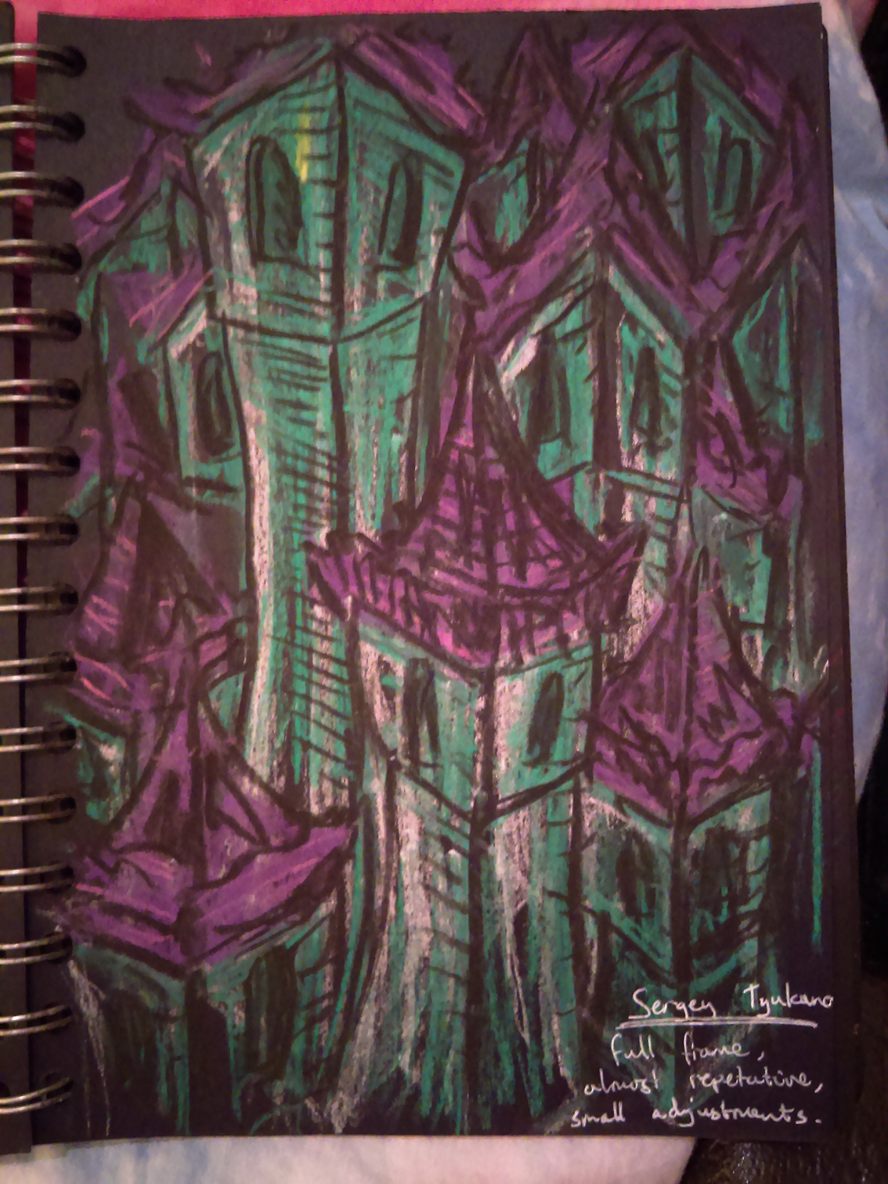
I have some small pieces of acrylic, which Sergey Tyukanov's style reminded me of, simply because of the intricacies and size of the piece, which I would like to etch onto. Using a black book and chalk (a medium I find quite quick and easy to mass produce work in), I have planned out many possibilities for these etchings. (I could also use the images as a source for my 3D blocks).


 I then used a white fine liner to sketch out the more detailed plans. This process was extremely useful as I normally work over a drawing when etching (onto glass or transparent perspex etc), but this time do not have the option.
Thursday, 3 November 2016
Floating City Drawing
The influence, as far as aesthetics go, was very much taken from Illustrators like Chris Riddell and Sergey Tyukanov. Yet it has the same basic principle as most other works for this project. I originally started it as a plan for a large etching, but with timing concerns and the print workshop coming up this Friday, I will look into printing the piece (and ask about screen printing onto the large piece acrylic as a nice round off point to the project). I wanted to create something which would help me get through my research period, yet it evolved into something more. There is so much of myself in this picture and my love for both architecture and fantasy both come through. Whether that is simply because of the time I put into the piece, I am not yet sure.


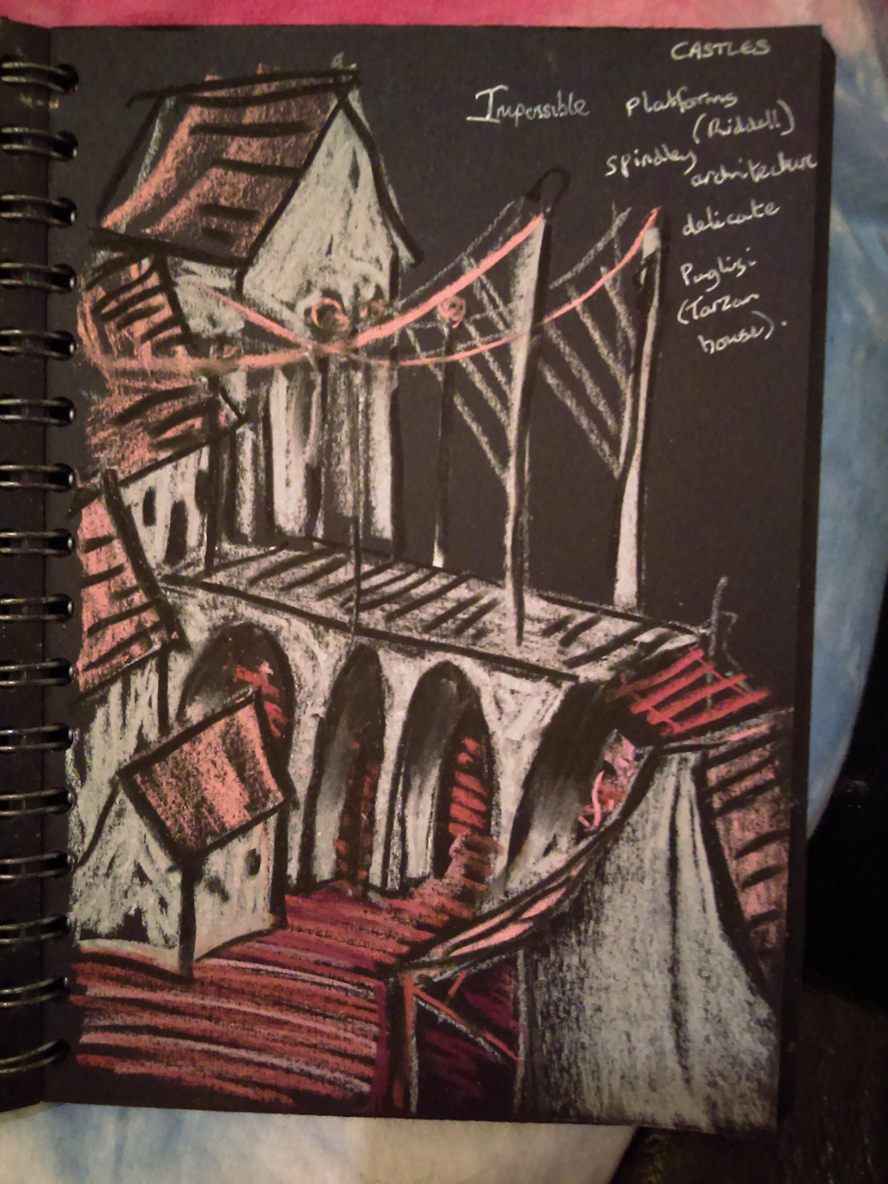
RESEARCH Jon Puglisi (Tarzan) and Chris Riddell
 Chris Riddell is the illustrator who worked on The Edge Chronicles by Paul Stewart. After reading the book I truly believe the unique style of spindley, rough illustrations really made the view I had of the world spectacular. Unlike with most relationships like this between artist and author, I find one really over shadows the other. While the images are amazing and valuable to the writing, this is not so true with the positions reversed. I got the feeling the writing only provides more details for images in the book, almost like when you see the movie before you read the book. Not, in this case, was that a particularly bad thing, the images formed such a unique style and form that they shaped the way the story played out in my head. So in some ways, certainly not all, even with a novel, having both images and text can be too much.
The images themselves (left, below) are so delicate and so unique they have this preciousness to them, I have rarely seen anything so animated yet detailed.


RESEARCH Shaun Tan
Shaun Tan is an illustrator who worked with horror and fictional books from a young age. While he now works with political and social books, his subject matter of fantastical imagery has persevered. His work is both narrative and imagery; he writes and illustrates his books himself. Like Tolkien, there is a symbiotic relationship between the two aspects, not really one without the other.

The drawings themselves are very surreal more than fantasy, while he does include architecture in his books, it is the surreal almost dadaist images in the book Rules of Summer- 2013. The books is based on two boys, and doesn't really have a linear narrative, but consists of a set of bizarre rules for them to follow and how they overcome these situations, like 'never leave a read sock on the clothesline' (Never leave a red sock on the clothesline- 2012, above). The images feature huge creatures and strange situations, which all appear seemlessly to be the imagination of the young boys. In this respect Tan has succeeded in creating a magical world for the two boys and anyone reading the book. Although without the text included, I can see the collection of images seeming extremely random, yet aesthetically similar.

The drawings themselves are very surreal more than fantasy, while he does include architecture in his books, it is the surreal almost dadaist images in the book Rules of Summer- 2013. The books is based on two boys, and doesn't really have a linear narrative, but consists of a set of bizarre rules for them to follow and how they overcome these situations, like 'never leave a read sock on the clothesline' (Never leave a red sock on the clothesline- 2012, above). The images feature huge creatures and strange situations, which all appear seemlessly to be the imagination of the young boys. In this respect Tan has succeeded in creating a magical world for the two boys and anyone reading the book. Although without the text included, I can see the collection of images seeming extremely random, yet aesthetically similar.
400 WORDS Tolkein
While most know JRR Tolkien as the author of The Lord of the Rings series, he also illustrated a collection of his ideas for how the scenes and settings should look. I found a book of his original drawings, Pictures by JRR Tolkien (first published in 1979), including the original monochromatic sketches and their coloured versions, watercolours and logo designs.
The Trolls (Below, left and right) is probably my favourite of the pieces, because of it's unique mark making and the dark, high contrast palette used. I think it is akin to my work in that I use alot of different lines in a stylistic way, but with dots. I would like to try this technique with my etching on the black acrylic, to somehow mimic the darkness captured. It almost reminds me of a negative photograph.


It was something someone said in my group crit that really got me looking at these: 'its almost Tolkien level architecture'. I began to think about what exactly that meant- I think it was while the pieces in Tolkien's books work because they are part of a story, my pieces are the story. I believe the impact of being able to create your own story for these worlds is just as powerful as having a novel with images attatched. What Tolkien has managed though, is to create drawings which completely match the feel of the books and encompass everything they contain; the mismatch of architecture, the mismatch of cultures and people; and the vast, complex histories that spread throughout the land within Middle Earth (in this way it can be compared to Skyrim).
I think it also means my most immersive drawings, much like Tolkien's, do not simply contain a building. The most successful of his pieces show the landscape, but not in an obvious way; in one where the ladscape appears to be an extension of the buildings. I think it adds to the realism of certain fantasies, that people in these books and games decide to build things in the most impractical of places, simply because they can; it's not real. I say that, even knowing this is entirely the point, floating cities and undergound countries are entirely possible in the worlds that artists like Tolkien have created.
(The Front Gate, below, left, Lake Town, below, right)


RESEARCH Davina Kirkpatrick
While there is not much to relate to with her work, Kirkpatrick's techniques and processes are really interesting. She was one of the artists I found in the book Glass and Print, and she mostly works within an architectural setting or 'commissioned glass projects for architectural contexts'.
I really love the idea of printing onto glass, and will perhaps take my project that way with my large drawing and the acrylic I have. For now, I'll leave this as a passing glance at her works, as I am not going too in depth into printing before Christmas due to the introduction being so late in the term, and there are only a few bits of info on her on the UWE website.
(Signing the River, below)

Wednesday, 2 November 2016
Post Silk Screen Printing Thoughts.
I immediately fell in love with the process of printing, but am unable to continue until the introductory workshop on the 25 of November. so I looked at some other ways of printing and working with glass. I would like to create another large drawing though, to both show my development since this print was concieved and to parhaps etch onto this large piece of acrylic.
While I am still planning the large etching, I am thinking of printing onto the piece. I have found a book called glass and print, which follows on well from the printing I have done. I will search the book and perhaps find further inspiration by looking into artists in this area. while the process of printing onto glass might be quite complex (further research required) I could perhaps print onto the plastic instead of an etching.
One artist who did catch my eye was Davina Kirkpatrick, someone who works on glass mainly in a architectural setting.
I also found a book called Wood Engraving, which mainly focuses on the literature aspect of printing, looking at victorian book illustrations and the process from the 1930's, and a lot of the processes in this book reflect the styles and techniques of other artists I have been looking at.
Silk Screen Printing
 I have decided to use this image to create prints from and familiarise myself with the process.
Subscribe to:
Comments (Atom)